Showing posts with label Income Inequality. Show all posts

Wednesday, July 18, 2018

The College Boost: Grads Still Outearn Nongrads | St. Louis Fed


College bonus 1
This is Part I of a three-part series from the Fed. A little more cheery than Part II, which I posted yesterday. I can't wait for Part III to see their solutions.
On average, families headed by someone with a four-year college degree have 69 percent more income and 201 percent more wealth than families without a degree. The gaps between nongrads and those with a postgraduate degree are even larger.
I fear they are going to bang the drums for equal funding for all school districts nationwide. It's all these socialists and Marxists know. They fail to realize and refuse to accept that even if you do that -- and there will be unintended/unforeseen consequences to doing that -- the race will still go to the swiftest and the fight to the strongest. That's the way to bet. 


from the St. Louis Fed:

The College Boost: Grads Still Outearn Nongrads


Monday, July 16, 2018


By William Emmons, Lead Economist; Ana Hernández Kent, Policy Analyst; and Lowell Ricketts, Lead Analyst, Center for Household Financial Stability
This is the first post in a series on the financial returns of college degrees.
A college degree has long been associated with a laundry list of positive outcomes:
  • Higher income and wealth
  • Better health
  • A higher likelihood of being a homeowner
  • A higher likelihood of being partnered (married or cohabitating)
  • A lower risk of falling behind on loan payments
In response, more and more Americans are pursuing—and earning—a bachelor’s degree. In 1989, about 23 percent of families were headed by someone with a four-year college degree or higher. By 2016, the share had reached 34 percent.
More individuals are continuing their schooling beyond the traditional four-year degree as well. Families headed by someone with a postgraduate degree (such as a master’s degree or Ph.D.) rose from almost 9 percent of all families in 1989 to about 13 percent in 2016.
This remarkable surge in highly educated individuals begs the question: How have the financial returns (expected earnings and wealth) of college degrees fared over time?

The Average Financial Returns to a College Degree


Previous work by our Center for Household Financial Stability has long corroborated the traditional wisdom that a college degree is associated with higher expected earnings and wealth.1 For this analysis, we typically used the Survey of Consumer Finances, often considered the gold standard of data on household balance sheets (asset, debt and income).
When evaluating the financial payoff to a college education, it is useful to ask: How much additional income and wealth does a college-educated family have beyond that of a family that doesn’t hold a college degree?

Income Differences


Pooling all available data (47,776 families), we found that the average family with a four-year degree (grads) earned approximately 69 percent more than the average family without a degree (nongrads). The average family with a postgraduate degree (postgrads) earned twice as much as their nongrad counterpart. Importantly, these estimates controlled for the age of the family, so we were comparing outcomes at similar stages of life.

Wealth Differences


What about wealth? College graduates—both grads and postgrads—accumulated much higher amounts of wealth over their lifetime than nongrads. On average, grad families accumulated 201 percent more, while postgrad families accumulated 242 percent more than their nongrad peers.
These boosts are remarkable, and it’s clear why going to college is such an imperative for individuals and families across the U.S. However, these average returns mask a considerably wide range of outcomes. How do these outcomes vary when considering the race and ethnicity as well as birth decade of these families? That will be the focus of the next post in this series.

Notes and References


1 For example, see Emmons, William R.; and Noeth, Bryan J. “Education and Wealth.” The Demographics of Wealth, Essay No. 2, May 2015.

Additional Resources


The College Boost: Is the Return on a Degree Fading? | St. Louis Fed

grad change expected income


I'm sure it's not the Feds fault, right?
On average, black college graduates born in the 1980s have little or no additional wealth above their counterparts without a degree. This is true for postgraduate degrees as well.
Get the Fed out of education and watch results go back to where they were before they put their hands on it.

But no!!  We'll continue to ask the arsonists to put out the fire. It appears we've definitely devalued or diminished, but not quite destroyed the value of an education in this country. God Bless America!!


from StLouisFed.org
https://www.stlouisfed.org/on-the-economy/2018/july/college-boost-return-degree-fading

The College Boost: Is the Return on a Degree Fading?


Tuesday, July 17, 2018

This is the second post in a series on the financial returns of college degrees.
By William Emmons, Lead Economist; Ana Hernández Kent, Policy Analyst; and Lowell Ricketts, Lead Analyst, Center for Household Financial Stability
Our May research symposium, “Is College Still Worth It: Looking Back and Looking Ahead,” identified how the returns to a college degree have changed over time and how those returns can be boosted going forward.
For our Center’s research contribution, we focused on how the financial returns to college have changed across generations. We concentrated on income and wealth outcomes for college graduates born in six decades:1
  • 1930s
  • 1940s
  • 1950s
  • 1960s
  • 1970s
  • 1980s
Among racial and ethnic groups, we had a large enough sample to break out our results for non-Hispanic white families and African-American or black families. Similar to the first post in this series, we looked at the boost to income and wealth associated with both four-year (grads) and postgraduate (postgrads) college degrees.

Expected Boost to Income Remains Strong

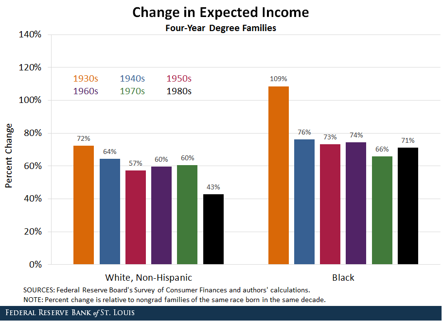
The figure below shows that expected incomes among grad families of either race have largely held steady across birth cohorts, with the exception of white grads born in the 1980s.
change expected income
Certainly, the returns were highest among older generations. By our measure, the 1930s generation benefited marvelously from earning a four-year degree. Incomes of grads born in the ‘30s were 72 percent and 109 percent higher than their nongrad peers for white and black families, respectively.
However, given statistical uncertainty or “noise,” we can’t definitively say that the incomes of grads born in the ‘30s were meaningfully higher than grads born in the ‘40s through ‘70s. This tells us that the expected boost to earnings associated with a four-year degree remains largely unchanged over time.
We can say that for white grads born in the ‘80s, their incomes were meaningfully lower than those of previous generations. However, it’s important to note that even the ‘80s grads received a sizable boost to their income. Thus, it appears that grad families of either race, born in any decade, reaped sizable rewards in the labor market.
What about postgraduate degrees? The next figure offers a similar look at the income boost among these highly educated families.
grad change expected income
Expected earnings associated with a postgraduate degree have declined somewhat over time among white families. Returns peaked at 108 percent higher income for postgrad families born in the '30s and gradually shifted down to 54 percent for the postgrads born in the '80s.
Among black postgrads, the earnings boost is considerably more volatile across generations. After looking at the statistical noise related to these estimates, we can’t say that the boost to black postgrad income has meaningfully changed over time.
Again, the '80s are a peculiar decade: Similar to their four-year degree counterparts, white postgrads born in the '80s have a lowest income boost than those born in the previous five decades.

The Wealth Advantage Is Falling

The majority of conversations involving the return to a college degree talk about what graduates earn in the job market following school. This is certainly important, and the evidence suggests that graduates continue to have superior incomes over their lifetime.
What is often obscured is how those graduates accumulate wealth over their lifetime. This is an important difference: Research has shown that assets—financial (such as stocks) and nonfinancial (such as a home)—are profoundly important for both financial security and upward mobility.
If wealth is so important, why is it left out of the conversation? Reliable and nationally representative household balance sheet data are notoriously hard to come by. It is precisely this reason that the Federal Reserve Board’s Survey of Consumer Finances (SCF) is such a valuable resource. Using SCF data, we found that the boost to wealth accumulation associated with college has fallen across generations.
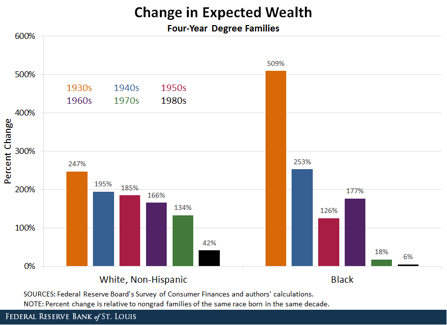
The wealth advantages afforded grad families, white and black, are shown in the figure below.
change expected wealth
A similar trend emerges: Grad families born in previous generations received a much greater boost to wealth accumulation than their nongrad peers. White and black grads born in the ‘30s accumulated 247 percent and 509 percent more wealth, respectively. This compares with 42 percent and 6 percent more wealth for white and black grads born in the ‘80s.
Black graduates born in the ‘70s also accumulated on average a historically low amount of wealth (18 percent) above their nongrad peers. Disturbingly, given the statistical uncertainty around our estimate for the wealth boost among black grads born in the ‘70s and ‘80s, we can’t say for certain that there even is a wealth advantage to a college degree for the average black family.
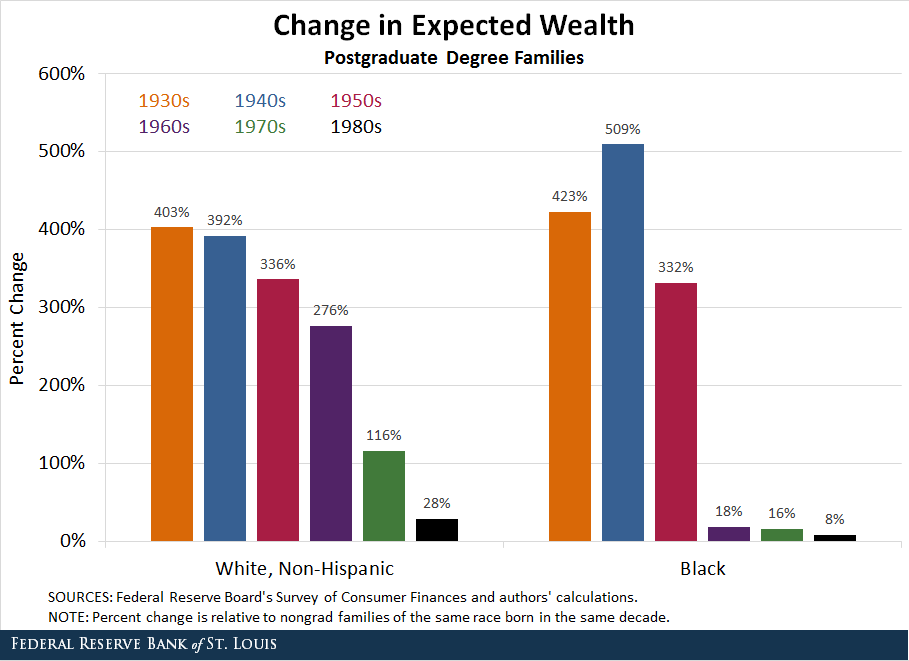
The fortunes of families holding postgraduate degrees are even dimmer by our estimates, as seen in our next figure.
grad change expected wealth
The enormous expected boost to wealth deteriorates rapidly between the ‘50s and ‘80s generations. Among white postgrads, the wealth boost ranged between 403 percent and 276 percent for postgrads born in the ‘30s through ‘60s.
Compare that with those born in the ‘70s and ‘80s, which had 116 percent and 28 percent higher expected wealth than nongrads. The boost estimated for white grads born in the ‘80s is almost negligible after accounting for statistical noise.
The picture is similar for black postgrads, although the decline in the wealth boost starts among postgrads born in the ‘60s. Black postgrads born in the ‘50s accumulated 332 percent more than their nongrad peers. Postgrads born in the ‘60s, ‘70s, and ‘80s accumulated only 18 percent, 16 percent and 8 percent, respectively, more than their nongrad peers.
All of those estimates were sufficiently noisy that we can’t rule out that they could be zero or even negative. The implication is shocking: Black postgrads born in the 1960s, ‘70 or ‘80s do not have statistically higher wealth than blacks who didn’t graduate from college.
Why have the wealth returns to both a four-year and postgraduate degree fallen so precipitously across birth cohorts while earnings have fared far better? The third and final post in this series will offer some potential explanations.

Notes and References

1 Our sample was too thin among families born before the 1930s and after the 1980s to provide reliable estimates.


Friday, July 24, 2015

Chart of the Day from Carpe Diem


mlb


9. Chart of the Day IV (above). For those who are upset by a CEO-to-worker pay ratio of 300:1, they must be really upset by the MLB star player-to-worker pay ratio of 500:1.

from Carpe Diem / AEI:


Thursday, June 04, 2015

Myths and Causes of Income Inequality | Just Facts Daily


Myths and Causes of Income Inequality
By James D. Agresti
May 22, 2015
New York Times economics analyst Eduardo Porter recently penned two columns about income inequality in which he claimed that the "job market is not working to distribute wealth" and "has lost much of its power to deliver income gains to working families" over the past four decades. As proof of this, he quoted data on "household incomes" from the U.S. and other countries.
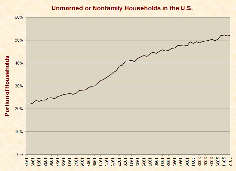
Such logic, which is common among those who claim that income inequality is at historic highs, suffers from a fatal flaw. This is because the disintegration of families has spread workers' wages over an increasing number of households during this era. As shown in the graph below, between 1967 and 2013, the portion of unmarried or nonfamily households in the U.S. rose from 29% to 52%:
unmarried_nonfamily_households_1947-2013A consequence of this marked decline in traditional family households is that household wages significantly understate job market gains. For instance, when a couple who each earns $50,000 per year gets separated or divorced, their incomes often remain the same, but their average household income drops from $100,000 to $50,000. In cases where only one spouse earns income, his or her earning power may decline due to the added responsibilities of single parenthood, and this single income may be split among two households due to alimony payments.
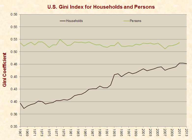
The effects of these family dynamics are evident in the Gini index, which is widely recognized by monetary institutions, economics textbooks, and academic journals as the most common measure of income inequality. Since 1967, which is as far back as the Census Bureau provides this data, the Gini index for households has consistently risen, prompting the Huffington Post (and others) to report that income inequality is at a "record high." That claim, however, is deceptive, because the Gini index for persons has been generally level throughout this period (hat tip: Political Calculations and Ivan O. Kitov):
gini_households_persons_1967-2013This stark difference between the Gini index for households and persons shows that rising household income equality has not been driven by "an inadequate job market" as Porter claims—but by the breakdown of families. Other facts relating to household structure and income underscore this reality:
  • Among children living with married parents, 35.6% have family incomes of $100,000 and above; while among children living with unmarried parents, 4.6% have family incomes of $100,000 and above.
  • Among people who are married, the poverty rate is 6%, as compared to 18% for people who are divorced, and 21% for people who have never married.
  • The poverty rate for black two-parent families is 9%, as compared to 27% for white single-mother families and 15% for white single-father families.
Liberals often argue that conservatives have mistaken the effect for the cause, and that economic hardship has spurred the decline of intact families instead of vice-versa. For example, Jeff Spross, the economics and business correspondent at The Week, has assertedthat the "primary" reason for the collapse of marriage in the U.S. is the "demise of good middle-class jobs and economic security." This notion is at stark odds with the fact that the median real income of U.S. households rose by 40% between 1979 and 2011.
A more nuanced and academic version of the argument made by Spross is that a decline in material welfare is not the cause of family breakdown but "a sense of economic despair" felt by poorer people because of the wealth gap between themselves and richer people. This theory, which is based on the Gini index for households, conflicts with the fact that the Gini index for persons has stayed flat for decades while the rates of unmarried and nonfamily households have soared. If this hypothesis had any merit, the Gini index for persons would have preceded and mirrored the decline in family cohesiveness.
Additionally, the Gini index does not capture all income and taxes, and if it did, it would likely show lower levels of inequality over the past several decades. This is evidenced by the Census Bureau's more comprehensive measures of household income, which are available from 1979 to 2003. These data account for numerous forms of income and taxes that are not included in the Bureau's standard measure of income, and the most comprehensive of these measures shows Gini figures and trends that are lower than the Bureau's standard measure.
A rational and factually coherent explanation for the decline of families is changes in ethics about extra-marital sex, divorce, and unwed child-bearing. Since Gallup began polling Americans on these issues in 2001, moral acceptance of extra-marital sex rose from 53% to 66%, divorce from 59% to 69%, and having a baby out of wedlock from 45% to 58%. These changes transpired in just the last 13 years, and much larger changes surely occurred during the sexual revolution that began in the 1940s and burgeoned in the 1960s to 1980s.
Summarizing the facts above, personal income inequality has not risen for half a century, and the rise of household income inequality stems from family disintegration driven by changing attitudes toward sex, marital fidelity, and familial responsibility.

Tuesday, March 03, 2015

STLFED: WEALTH INEQUALITY MAY BE A BIGGER PROBLEM IN THE US THAN INCOME INEQUALITY


But, on the other hand, not all Wealth Inequality is bad. You gotta love those two-handed economists and politicians. 

During the Clinton era, the President himself defended the burgeoning wealth and income inequality that was developing during the dot.com bubble. This according to no less an authority than Allan Greenspan in his book "The Age of Turbulence". Clinton's rationale is that this is what one would expect and was a welcome development during a period of economic growth. 

Hmmm..............

I'm pretty sure that the good folks at the Federal Reserve know of Hayek, they just don't believe Hayek. And why would they? He just makes too much common sense for them.

Mandating equal outcomes leads to unfair treatment

MARCH 03, 2015 by LEVAN GVALIA
From the fact that people are very different it follows that, if we treat them equally, the result must be inequality in their actual position, and that the only way to place them in an equal position would be to treat them differently....
We do not object to equality as such.... Our objection is against all attempts to impress upon society a deliberately chosen pattern of distribution, whether it be an order of equality or of inequality.
- FA Hayek, The Constitution of Liberty


07/29/14
Wealth Inequality May Be a Bigger Problem in the U.S. Than Income Inequality
U.S. income inequality has been a focal point of PUBLIC discussion and debate in recent years, with claims that it is severe and that the distribution is becoming increasingly unequal over time. However, wealth inequality is a much greater dilemma, according to a recent article from The Regional Economist, published by the Federal Reserve Bank of St. Louis.Income InequalityRESEARCH Director and Economist Christopher Waller and Senior Research Associate Lowell Ricketts, both with the St. Louis Fed, noted that, "Households in the top 10 percent of the income distribution have earnings so great that they raise mean income over the median for the entire population." In 2010, the median household income was about $46,000, while the mean income was close to $78,500. They also noted that some inequality in the U.S. income distribution naturally develops between age groups and that a lot of it is determined by educational attainment.Waller and Ricketts used a simple measure to see how income inequality in the U.S. compared to other countries around the world (which will be discussed on this blog Thursday) and how it compared to wealth inequality in the U.S. They used the ratio of the median income of the top 10 percent of the income distribution ($203,900) divided by the median income of the bottom 10 percent ($9,900). "The resulting ratio of 21 quantifies the substantial divide between the rich and the poor in the U.S."

Wealth InequalityWaller and Ricketts then examined U.S. wealth inequality in terms of net worth, defined as household assets less liabilities.1 In 2010, the median net worth of all households was $77,300. "Just as there was with the income statistics, there is a substantial divide between median and mean net worth. Mean net worth was $499,000, indicative of an even more top-heavy distribution than that of income."
Using income distribution, Waller and Ricketts calculated the same ratio as used above. The median net worth of the top 10 percent of the income distribution ($1.194 million) divided by the median net worth of the bottom 10 percent ($3,100) yields a wealth inequality ratio of 385, notably higher than the ratio of 21 for income inequality.
Using net worth distribution to define the population groups changes the statistics even more dramatically, as the bottom 20 percent of the distribution has a negative median net worth. The ratio of the median for the top 10 percent ($1.9 million) divided by the median for the bottom 30 percent ($700) yields a ratio of 2,714.

Not All Wealth Inequality Is BadWaller and Ricketts explained that some wealth inequality is a function of age, allowing people to maintain a stable path of consumption over their life spans. Young people have little wealth and tend to be unskilled, so they borrow money for school and their first home. In middle age, they start paying down their DEBTand accumulating wealth while entering their peak earning years. As they get older, they start spending down the wealth they accumulated. Waller and Ricketts said, "This natural life cycle of wealth accumulation hasn't changed much, and most Americans will progress along a similar path. While the process is the same for most people, at any one point in time you're going to have relative inequality: poor, middle and rich based on age alone. While this natural inequality doesn't account for the entire wealth disparity across the population, it is important to understand that some inequality isn't inherently bad." Waller and Ricketts concluded, "The labor market has changed into a system that places a greater value on EDUCATION than physical labor and rewards skilled workers with wage premiums. This system is characterized by substantial inequality, but it doesn't inherently exclude anyone from climbing the income brackets. … Wealth inequality is a much greater dilemma, but it is often unaddressed in the public debate outside of tax proposals. … Financial education initiatives could use some of the energy devoted to the fierce debate surrounding income inequality in the U.S."

Notes and References1 Household assets include both financial (such as retirement accounts, STOCKS AND BONDS) and nonfinancial (such as cars, homes and small businesses).
Additional Resources

from fee.org
http://fee.org/blog/detail/economic-equality-and-social-injustice-video


Economic Equality and Social Injustice (Video)

Mandating equal outcomes leads to unfair treatment

MARCH 03, 2015 by LEVAN GVALIA
From the fact that people are very different it follows that, if we treat them equally, the result must be inequality in their actual position, and that the only way to place them in an equal position would be to treat them differently....
We do not object to equality as such.... Our objection is against all attempts to impress upon society a deliberately chosen pattern of distribution, whether it be an order of equality or of inequality.
- FA Hayek, The Constitution of Liberty


Wednesday, July 02, 2014

Income Inequality...Cured. Get (and stay) educated, Get (and stay) employed, Get (and stay) married


Three important "Get and Stays" and a lot of this country's problems would disappear. 
PROBLEM SOLVED. YOUR WELCOME!!! 
It even makes Bloomberg embrace conservative values. It must be that obvious. 


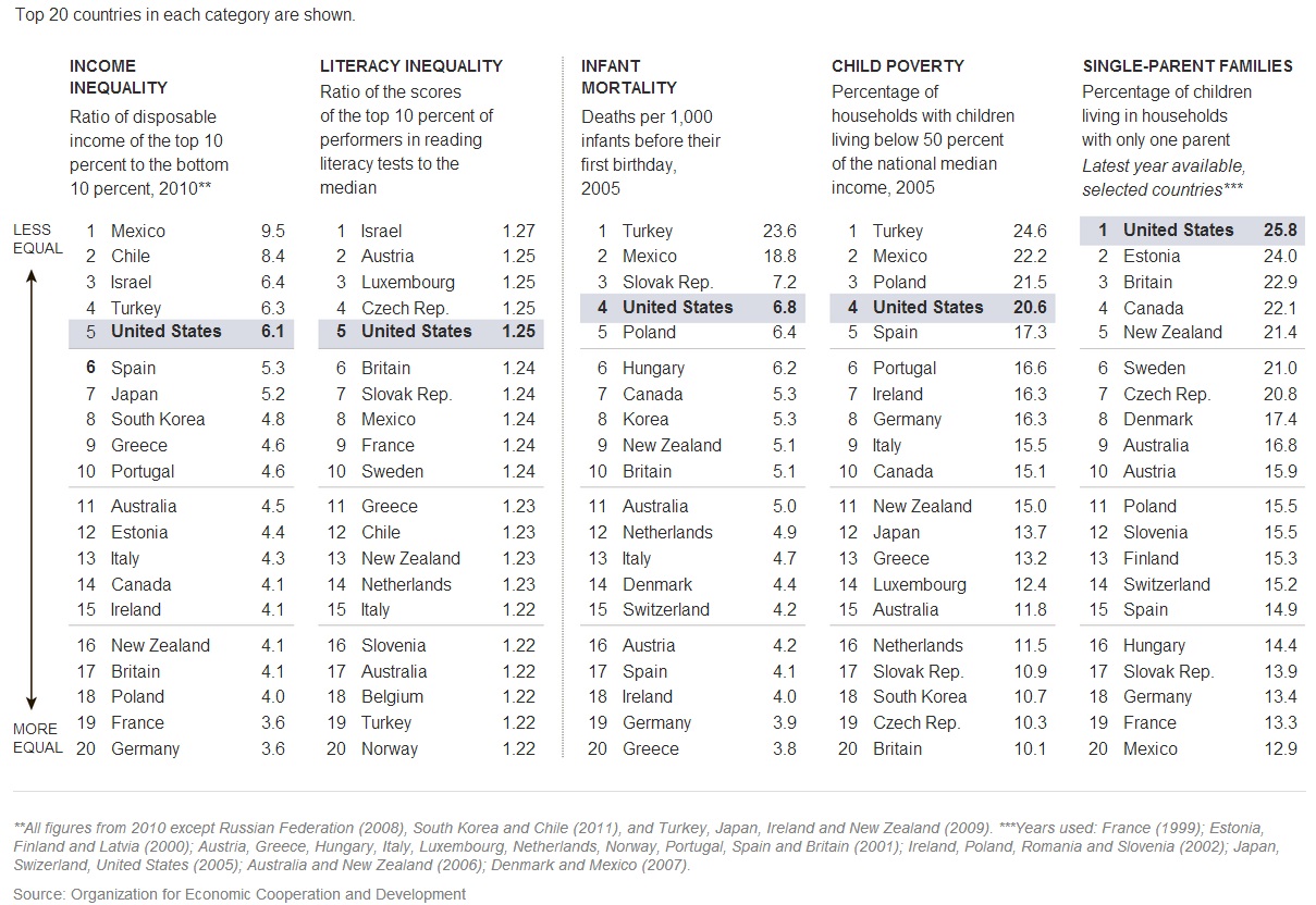
The U.S. compares very poorly to most other Western industrialized nations:
http://www.ritholtz.com/blog/wp-content/uploads/2013/07/fdafd.jpg
Washington may pay lip service to reducing inequality. But – as we will show below – bad government policy is largely responsible.
The Hard Facts of Inequality

A who's-who's of prominent economists in government and academia have all said that runaway inequality can cause financial crises.
from Carpe Diem:


Posted: 06 Dec 2013 09:03 AM PST
This week, President Obama called America's "dangerous and growing" income inequality the "defining challenge of our time,"and he plans to put the issue of income inequality at the center of his agenda during the remainder of his second term. The president is not alone in his concern about income inequality – there's been a lot of discussion in recent years on the issue, especially concerns about "increasing income inequality." That concern is demonstrated by more than 1 million search results for the term "increasing income inequality" on Google. However, there's apparently not as much attention or concern about "explaining income inequality" (there are only178,000 Google search results for that term), and that's the topic that this post will attempt to address.

Most of the discussion on income inequality focuses on the relative differences over time between low-income and high-income American households, but it's also instructive to analyze the demographic differences among income groups at a given point in time to answer the question: How are high-income households different from low-income households?

The chart above (click to enlarge) shows some key demographic characteristics of U.S. households by income quintiles for 2012, using updated data from the Census Bureau (here, here and here, and see my previous versions of this analysis for years 2009 and 2010 and 2011).
Below is a summary of some of the key demographic differences between American households in different income quintiles in 2012:

1. Mean number of earners per household. On average, there are significantly more income earners per household in the top income quintile households (2.04) than earners per household in the lowest-income households (0.45). It can also be seen that the average number of earners increases for each higher income quintile, demonstrating that one of the main factors in explaining differences in income among U.S. households is the number of earners per household. Also, the unadjusted ratio of average income for the highest to lowest quintile of 15.8 times ($181,905 to $11.490), falls to a ratio of only 3.5 times when comparing "income per earner" of the two quintiles: $89,169 for the top fifth to $25,533 for the bottom fifth.

2. Share of households with no earners. Sixty-one percent of U.S. households in the bottom fifth of Americans by income had no earners for the entire year in 2012. In contrast, only 3% of the households in the top fifth had no earners in 2012, providing more evidence of the strong relationship between household income and income earners per household.

3. Marital status of householders. Married-couple households represent a much greater share of the top income quintile (77.5%) than for the bottom income quintile (17%), and single-parent or single households represented a much greater share of the bottom 20% of households (83.0%) than for the top 20% (22.5%). Like for the average number of earners per household, the share of married-couple households also increases for each higher income quintile.

4. Age of householders. Almost 8 out of every 10 households (79.5%) in the top income quintile included individuals in their prime earning years between the ages of 35-64, compared to fewer than half (47.3%) of household members in the bottom fifth who were in that prime earning age group last year. The share of householders in the prime earning age group of 35-64 year olds increases with each higher income quintile.
Compared to members of the top income quintile of households by income, household members in the bottom income quintile were 1.6 times more likely (23.5% vs. 14.8%) to be in the youngest age group (under 35 years), and more than 5 times more likely (29.2% vs. 5.7%) to be in the oldest age group (65 years and over).

6. Work status of householders. More than four times as many top quintile households included at least one adult who was working full-time in 2012 (78.2%) compared to the bottom income quintile (only 18.2%), and more than five times as many households in the bottom quintile included adults who did not work at all (67.3%) compared to top quintile households whose family members did not work (12.5%). The share of householders working full-time increases at each higher income quintile.

7. Education of householders. Family members of households in the top fifth by income were six times more likely to have a college degree (77.2%) than members of households in the bottom income quintile (only 12.9%). In contrast, householders in the lowest income quintile were 26 times more likely than those in the top income quintile to have less than a high school degree in 2012 (26.7 % vs. 1.0%). As expected, the Census data show that there is a significantly positive relationship between education and income.

Bottom Line: Household demographics, including the average number of earners per household and the marital status, age, and education of householders are all very highly correlated with household income. Specifically, high-income households have a greater average number of income-earners than households in lower-income quintiles, and individuals in high income households are far more likely than individuals in low-income households to be well-educated, married, working full-time, and in their prime earning years. In contrast, individuals in lower-income households are far more likely than their counterparts in higher-income households to be less-educated, working part-time, either very young (under 35 years) or very old (over 65 years), and living in single-parent households.

The good news is that the key demographic factors that explain differences in household income are not fixed over our lifetimes and are largely under our control (e.g. staying in school, getting and staying married,etc.), which means that individuals and households are not destined to remain in a single income quintile forever. Fortunately, studies that track people over time indicate that individuals and households move up and down the income quintiles over their lifetimes, as the key demographic variables highlighted above change, see CD posts here, here andhere. And Thomas Sowell pointed out earlier this year in his column "Income Mobility" that:
Most working Americans who were initially in the bottom 20% of income-earners, rise out of that bottom 20%. More of them end up in the top 20% than remain in the bottom 20%. People who were initially in the bottom 20% in income have had the highest rate of increase in their incomes, while those who were initially in the top 20% have had the lowest. This is the direct opposite of the pattern found when following income brackets over time, rather than following individual people.


It's highly likely that most of today's high-income, college-educated, married individuals who are now in their peak earning years were in a lower-income quintile in their prior, single younger years, before they acquired education and job experience. It's also likely that individuals in today's top income quintiles will move back down to a lower income quintile in the future during their retirement years, which is just part of the natural lifetime cycle of moving up and down the income quintiles for most Americans. So when we hear the President and the media talk about an "income inequality crisis" in America, we should keep in mind that basic household demographics go a long way towards explaining the differences in household income in the United States. And because the key income-determining demographic variables change over a person's lifetime, income mobility and the American dream are still "alive and well" in the US.


 ---

from Carpe Diem:

Posted: 04 Feb 2014 01:22 PM PST
Income2012

In a December 2013 CD post, I featured the chart above (click to enlarge) that displays Census Bureau data of various household demographic factors by income quintile in 2012 (education, marital status, average number of earners, percent working full-time, age, etc.) that help us understand the factors that explain differences in household income.

In a recent National Review article ("The Working Rich"), Kevin Williamson refers to some similar, slightly older data (from 2011 I think) to make several important points: a) the wealthiest and highest-earning Americans are not "idle rich" but rather work very hard for their money, and b) the poor can learn some lessons from them to become more wealthy themselves. Here's an excerpt:
Rich America is working America: Wealthy households contain on average more than four times as many full-time workers as do poor households, and, surprisingly, inherited wealth constitutes a smaller share of their assets than it does for middle-class and poor households. They live modestly relative to their means and for the most part do not work on Wall Street or as corporate executives. The caricature of the rich American as a child of privilege who inherited a fortune and spends his days shuttling between mansions in a private jet is largely a product of the imagination of such would-be class warriors as Elizabeth Warren and Robert Reich, neither of whom lives in Section 8 housing, or even downwind of it.

There is a reason that money earned from work accounts for a relatively large share of the holdings of rich Americans: They work more — a lot more. While Census Bureau data document a very large gap in the prevalence of college degrees among the top 20 percent  of  households vs. the bottom 20 percent, there is an even larger and more significant gap — 60 percentage points — between full-time employment for householders in the top income group (78.2% in 2012, see chart above) vs. the bottom income group (18.2%). There is, to be sure, such a thing as the working poor, but the most salient characteristic of poor households is the lack of full-time workers in them. For the bottom income group, there is an average of 0.42 earners per household (0.45 in 2012), with 68.2 percent (67.3 percent in 2012) of householders not working at all, as opposed to 1.97 earners (2.04 in 2012) per household and only 13.3 percent (12.5 percent in 2012) not working for the highest income group. The answer to poverty turns out to be "get a job," after all — though that should be an aspiration toward which we assist the poor rather than a contemptuous dismissal of their needs.

Family matters. Not surprisingly, 78.4 percent (77.5 percent in 2012) of those highest-income families were married couples, as opposed to 17 percent (18.2 percent) for the lowest-income group. What this all means in brief is that the highest-income families are composed almost exclusively of two-earner households, the overwhelming majority of them married couples. Those who are inclined to see public policy mainly through green eyeshades may sniff at the social conservatives and their quaint worries about marriage, but there is a very strong connection between how we conduct our family lives and our economic outcomes — the very word "economy" derives from the Greek term for household administration, οἰκονομία. All the best people may roll their eyes at "tiger mom" Amy Chua's admiration for Asian-American, Nigerian-American, and Mormon domestic culture, but it is difficult to dismiss the results.
MP: As I concluded in my December post, household demographics like the average number of earners per household and the marital status, age, and education of householders are all very highly correlated with household income. Specifically, high-income households have a greater average number of income-earners than households in lower-income quintiles, and individuals in high income households are far more likely than individuals in low-income households to be well-educated, married, working full-time, and in their prime earning years. In contrast, individuals in lower-income households are far more likely than their counterparts in higher-income households to be less-educated, working part-time, either very young (under 35 years) or very old (over 65 years), and living in single-parent households.

The good news is that the key demographic factors that explain differences in household income are not fixed over our lifetimes and are largely under our control (e.g. staying in school, getting and staying married,etc.), which means that individuals and households are not destined to remain in a single income quintile forever. Fortunately, studies that track people over time indicate that individuals and households move up and down the income quintiles over their lifetimes, as the key demographic variables highlighted above change. And as Kevin points out, if the poor pay attention, they can learn from the rich and become better off themselves by investing in education, getting and staying married, and working full-time.


Is Inequality a Problem that needs Fixing?


Put me down for a "NO" on this one. 

Giants Top Minor League Prospects

  • 1. Joey Bart 6-2, 215 C Power arm and a power bat, playing a premium defensive position. Good catch and throw skills.
  • 2. Heliot Ramos 6-2, 185 OF Potential high-ceiling player the Giants have been looking for. Great bat speed, early returns were impressive.
  • 3. Chris Shaw 6-3. 230 1B Lefty power bat, limited defensively to 1B, Matt Adams comp?
  • 4. Tyler Beede 6-4, 215 RHP from Vanderbilt projects as top of the rotation starter when he works out his command/control issues. When he misses, he misses by a bunch.
  • 5. Stephen Duggar 6-1, 170 CF Another toolsy, under-achieving OF in the Gary Brown mold, hoping for better results.
  • 6. Sandro Fabian 6-0, 180 OF Dominican signee from 2014, shows some pop in his bat. Below average arm and lack of speed should push him towards LF.
  • 7. Aramis Garcia 6-2, 220 C from Florida INTL projects as a good bat behind the dish with enough defensive skill to play there long-term
  • 8. Heath Quinn 6-2, 190 OF Strong hitter, makes contact with improving approach at the plate. Returns from hamate bone injury.
  • 9. Garrett Williams 6-1, 205 LHP Former Oklahoma standout, Giants prototype, low-ceiling, high-floor prospect.
  • 10. Shaun Anderson 6-4, 225 RHP Large frame, 3.36 K/BB rate. Can start or relieve
  • 11. Jacob Gonzalez 6-3, 190 3B Good pedigree, impressive bat for HS prospect.
  • 12. Seth Corry 6-2 195 LHP Highly regard HS pick. Was mentioned as possible chip in high profile trades.
  • 13. C.J. Hinojosa 5-10, 175 SS Scrappy IF prospect in the mold of Kelby Tomlinson, just gets it done.
  • 14. Garett Cave 6-4, 200 RHP He misses a lot of bats and at times, the plate. 13 K/9 an 5 B/9. Wild thing.

2019 MLB Draft - Top HS Draft Prospects

  • 1. Bobby Witt, Jr. 6-1,185 SS Colleyville Heritage HS (TX) Oklahoma commit. Outstanding defensive SS who can hit. 6.4 speed in 60 yd. Touched 97 on mound. Son of former major leaguer. Five tool potential.
  • 2. Riley Greene 6-2, 190 OF Haggerty HS (FL) Florida commit.Best HS hitting prospect. LH bat with good eye, plate discipline and developing power.
  • 3. C.J. Abrams 6-2, 180 SS Blessed Trinity HS (GA) High-ceiling athlete. 70 speed with plus arm. Hitting needs to develop as he matures. Alabama commit.
  • 4. Reece Hinds 6-4, 210 SS Niceville HS (FL) Power bat, committed to LSU. Plus arm, solid enough bat to move to 3B down the road. 98MPH arm.
  • 5. Daniel Espino 6-3, 200 RHP Georgia Premier Academy (GA) LSU commit. Touches 98 on FB with wipe out SL.

2019 MLB Draft - Top College Draft Prospects

  • 1. Adley Rutschman C Oregon State Plus defender with great arm. Excellent receiver plus a switch hitter with some pop in the bat.
  • 2. Shea Langliers C Baylor Excelent throw and catch skills with good pop time. Quick bat, uses all fields approach with some pop.
  • 3. Zack Thompson 6-2 LHP Kentucky Missed time with an elbow issue. FB up to 95 with plenty of secondary stuff.
  • 4. Matt Wallner 6-5 OF Southern Miss Run producing bat plus mid to upper 90's FB closer. Power bat from the left side, athletic for size.
  • 5. Nick Lodolo LHP TCU Tall LHP, 95MPH FB and solid breaking stuff.